


Subscribe To
Friday, 27 April 2012


Thursday, 26 April 2012


Wednesday, 25 April 2012
Zelda make it rain please


The Zombie of OZ


Tuesday, 24 April 2012
Work in Progress

Every graphic designer understands how time-
consuming and complex design-making can be.
I stumbled upon this shirt - and I thought it to be
quite clever with our profession.
Monday, 23 April 2012
Star Wars
Amazing drawing great color choices. Good repetition of elements around the storm trooper helmet. It really trippy if it were glow in the dark, Really good use of patterns and gradients. Got this from http://www.snorgtees.com/


Batman and Robin
Really cool take on Batman and Robin. The hand drawn aspect gives the shirt a more interesting look at. The simple spot colors really brings the images to life. Got this from http://www.snorgtees.com/


Monday, 16 April 2012
http://www.c8six.com/

He sells his designs on Threadless or you can buy them on his portfolio website.
www.freshfauxx.com


As I was searching the internet for more shirts to post (also to avoid designbyhumans because I rely on them too much) I found a link that brought me to FreshFauxx. It is a website belonging to a artist who designs shirts, a portfolio sight. But then on looking through and finding this shirt which I love, he is a competitor on designbyhumans. So much for trying to avoid that site.
Anyways... The shirt is amazing. That humming bird is actually embroidered onto the shirt. I also thought the mass of swirling colours below it were a nice touch as the bird is someone colourless in comparison. The swirling colours almost act like the wind, the motion that the little bird is making. Take a look at the website for more shirts by the artist, Herman Lee!
Blackbirds


What caught my attention about this shirt was the black and white. The first thing that crossed my mind was trying to figur out if the shirt was black or was it white (but then I saw the back of the shirt and knew it was black). I think having the birds shapes cut into the white was a neat and easy effect. I also love how the birds explode from the bottom left like that. It's called Blackbird's Attackin' In The Dead 'O' Night.
Found it on what is now one of my favourite websites, Designbyhumans. If you haven't taken a look at the website recently or not at all take a look now. It's well worth it. They have recently updated the website with new shirts that have won contests
Friday, 13 April 2012


Thursday, 5 April 2012


Nature

I think the design to this shirt is clever, showing the typography transforming each letter into images that takes its shape. Im not quote sold on the colour of the shirt though could have used a light colour of green instead maybe. Overall very much enjoy the message.

Wednesday, 4 April 2012

Thursday, 29 March 2012


Design Battles; Threadless
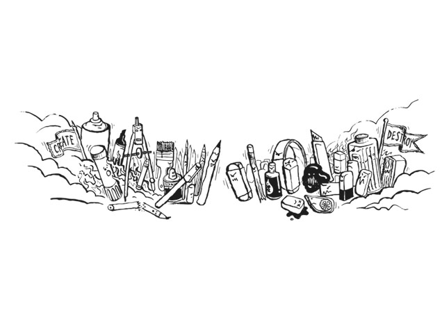
Through my searches for new shirts to post I have come across one that is a little funny in the way of design. The shirt depicts a battle between everything we as artists use to design and everything else we use to erase those designs. It is in black and white and done as if drawn in pen. Shirt is inexpensive and can be found at this link. Please take a look at this website, you won't regret it.

Subscribe to:
Comments (Atom)